Blog
How to personalize your home
Hey y’all! Today I'm thrilled to share some of my favorite tips on how to personalize your home. Creating a space that reflects your unique style and personality is what home design is all about. So, let's dive in and discover the wonderful world of home personalization!
Start with Your Story
Every home has a story to tell, and the first step to personalizing it is to recognize and celebrate your own story. Think about your favorite memories, places you've been, and experiences that have shaped your life. Incorporate these elements into your home's decor. Whether it's a gallery wall with photos from your travels or a cherished family heirloom on display, your home should be a reflection of your journey.
Embrace Your Style
Your personal style is an essential part of making your home feel like, well, home! Whether you're into modern minimalism, farmhouse charm, or a blend of different styles, embrace what resonates with you. Mix and match styles, but remember to maintain a cohesive theme throughout your home for a polished and personalized look.
2. Handmade and DIY
DIY projects and handmade crafts add a personal touch to your home like nothing else can. Create your own artwork, throw pillows, or customized furniture. Not only will this save you money, but it will also infuse your home with your unique personality. Crafting together as a family is a great way to create lasting memories and decorations at the same time.
3. Collect Memories, Not Things
As much as I love beautiful decor, it's essential to remember that your home should be a place to create memories, not just to showcase things. Make sure to incorporate spaces for gatherings and quality time with your loved ones. Create a cozy reading nook or a space for family game nights. It's these experiences that truly personalize your home.
4. Paint and Wallpaper
One of the quickest ways to personalize a space is through color. Paint can transform a room's mood and character. Choose colors that resonate with you, whether they're soft and neutral or bold and vibrant. Wallpaper is another option that adds texture and pattern to your walls. Be adventurous and don't be afraid to experiment with accent walls or ceiling treatments.
5. Upcycling and Repurposing
Instead of always buying new furniture and decor, consider upcycling and repurposing items you already have or discover at thrift stores. Whether it's refinishing an old dresser or turning vintage windows into a charming room divider, these projects give your home a sense of history and uniqueness.
6. Family Keepsakes
Incorporating family keepsakes and heirlooms into your decor is a wonderful way to personalize your home. Display your grandmother's china in a hutch, frame your great-grandfather's love letters, or create a shadow box with meaningful mementos. These pieces not only tell your family's story but also add a touch of warmth and history to your home.
7. Nature's Touch
Bringing nature indoors is one of my favorite ways to personalize a space. Use fresh flowers, potted plants, or even branches from your yard to add a touch of greenery to your decor. It's amazing how a bit of nature can instantly make your home feel cozier and more inviting.
8. Personalized Art
Invest in artwork that speaks to you, or better yet, create your own! Whether it's a beautiful canvas painting, a piece of custom woodwork, or even a stunning metal wall art, art should evoke emotion and tell a story. It's a fantastic way to inject personality and style into your home.
9. Sentimental Accessories
Decorate with items that hold sentimental value, like that quilt your grandmother made or the vintage typewriter you found at a flea market. These accessories will infuse your home with a sense of history and charm, making it uniquely yours.
10. Custom Furniture
Sometimes, you can't find the perfect piece of furniture that fits your vision. In such cases, consider investing in custom-made furniture. It allows you to choose the design, materials, and finishes, ensuring that each piece complements your personal style and the layout of your home.
11. Lighting Matters
Don't underestimate the power of lighting in personalizing your space. Unique light fixtures and lamps can be statement pieces that set the tone for your home. Experiment with various styles, from vintage chandeliers to industrial pendant lights, and let your lighting choices reflect your personality.
12. Rearrange and Redecorate
Don't be afraid to change things up in your home from time to time. Experiment with furniture arrangements, swap out decor items, and refresh your space as the seasons change. Rearranging and redecorating can give your home a fresh, personalized feel without any major renovations.
Remember, personalizing your home is a journey, not a destination. Take your time, let your creativity flow, and don't be afraid to make mistakes. Your home should be a reflection of you and your family, a place where memories are made, and where your story unfolds. So, go ahead and make your home uniquely yours!
2023 Trends
A new year means new inspiration in the interior design trends we’re seeing! There’s a return to bold, statement-making moments and elements that pack personality with an organic and textural quality. Here are a couple that I’m currently loving!
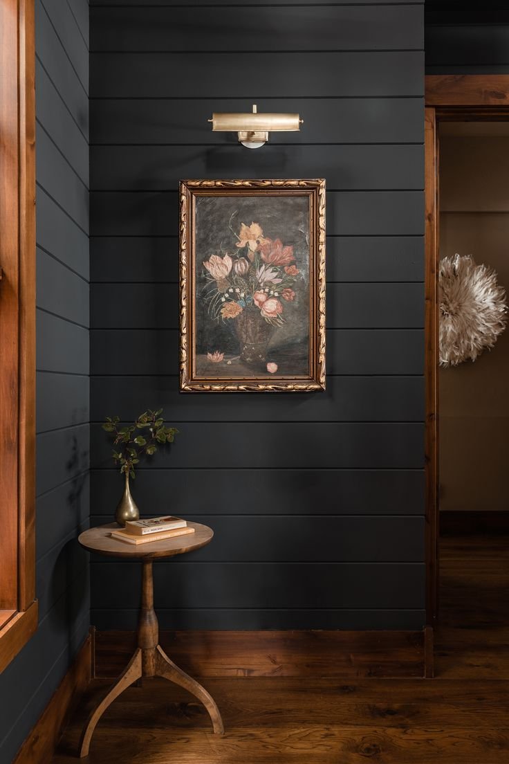
Rich Tones
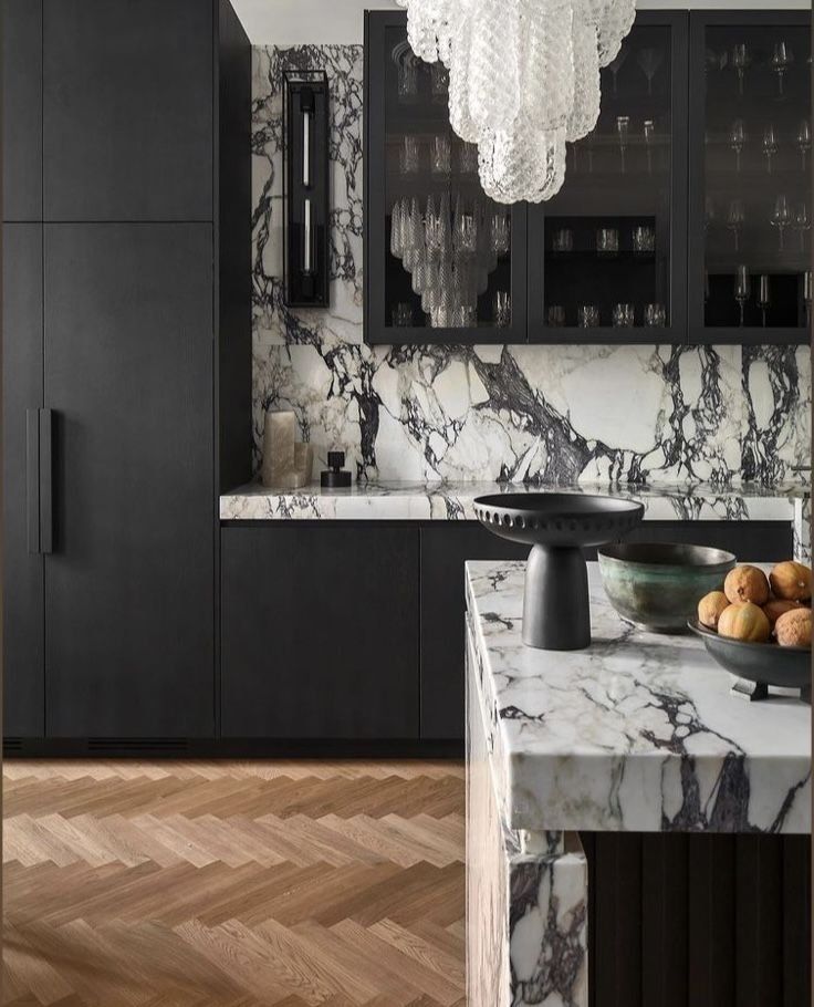
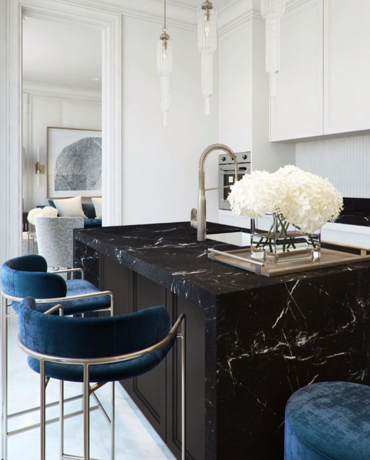
Statement Stone
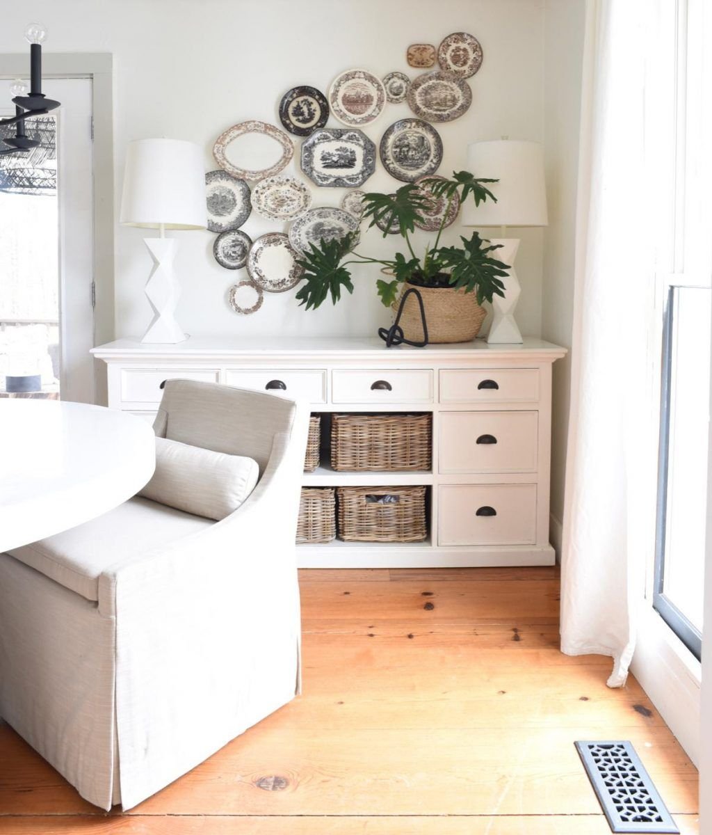
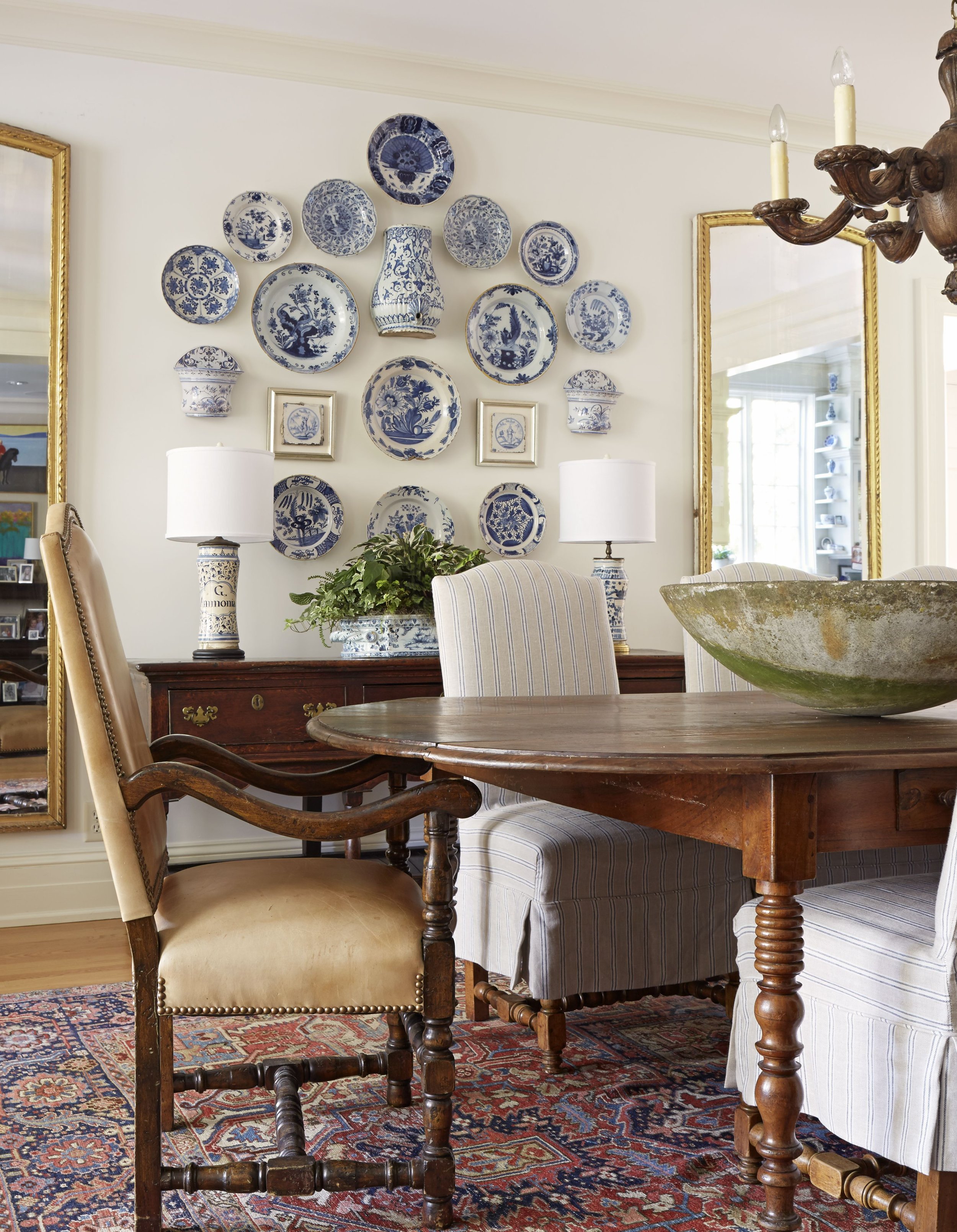
Nostalgia
Rich Tones
Let’s start with a trend that we’ve been seeing, but is making huge tides in the design world & isn’t going anywhere soon. Dark paint colors with rich colors add deep tones and create a design that is awe-worthy. Simple ways to include this trend in your home include adding jewel tones, through the patina of antique brass, lacquered finishes, and through metals.
2. Statement Stone
This trend can be seen mainly in kitchen, but feel free to add throughout the entire home. We’re talking marble with lots of veining and personality, contrasting the pairings of stone, and continuing the countertop in a kitchen up to the back-spalsh.
3. Nostaligia
Overall, there is a trend of returning to traditional design. This can be seen through the “grand millenial” and Grand Coastal design styles that have taken over social media. We’re seeing homage being paid through design elements like vintage plate walls, wooden kitchen hutches, traditional prints and patterns, and thrifted pieces with a story attached. Florals abound and other more fanciful materials like fringe, scallops, and contrasting piping.
Overall, I’m excited about the design trends of 2023 and hope you are as well! What trend are you most excited about? I love the fact that design is moving back towards including thrifted and family heirlooms that tell the story of your family and home!
all images from pinterest*
Favorite Green Paint Colors
This year has already been flying by! I can’t believe it’s already the end of March. This weekend I did the finishing touches on three local projects and they all had something in common! They all wanted shades of green in their designs. Dark green is definitely a trending color right now, and I love adding it into spaces I design. I also recently painting my office green! Anyways, I thought since all these clients were wanting green shades, some other people may be looking at updating their home with shades of green as well. So here are my top choices for green paint!
Dark green is all the trend right now! So here are my top choices for a dark, deep, green!
Sherwin Williams Rock Garden
Farrow & Ball Studio Green
Benjamin Moore Hunter Green
Benjamin Moore Salamander
There are so many other amazing dark green colors, but I find myself going back to these options when sourcing paint for clients. If your in the market for a dark green paint color, I’d suggest starting with these four options, getting samples, and seeing how they look in your space!
Love the green trend, but not sure you want to go super dark? These medium green tones are a great option for you! When choosing a modern paint color, I always look for a gray undertone and each of these options have that! Here are my top choices for a medium green!
Farrow & Ball Card Room Green
Sherwin Williams Privilege Green
Benjamin Moore Backwoods
Farrow & Ball Duck Green
Maybe light green is more you thing! As with the medium green shades, these all have a gray/neutral undertone which helps the color look more modern and neutral. My top picks for light green are:
Farrow and Ball Mizzle
Benjamin Moore Hollingsworth Green
Sherwin Williams Cascade Green
Sherwin Williams Liveable Green
As with all paint colors, I always recommend getting samples because the color can look vastly different from room to room depending on how much natural light the space gets. Once you have samples up on the wall see which options you like and go from there. If you need additional help with paint options feel free to reach out for a custom paint consultation where I’ll recommend paint colors for your home to give a modern and cohesive feel throughout!
2021: Year in Review
I cannot believe that we are already at the end of 2021! This year my business has grown so much more than I imagined back when I started it in November of 2019. In fact, this past January I was able to quit my full time job to focus on E. Bullister Design Co. full time! This is something I will forever be grateful for, so thank you to all my friends, family, clients, and cheerleaders! Y’all have made this little dream of mine into a reality!
This year we helped over 30 families design spaces that were functional and beautiful! We served clients in 15 states and 2 countries! Most clients lived in California and Texas!
Next year, I’m hoping to grow this business even more, offer more creative solutions and packages to meet every families need and get more into commercial design (In school, I always thought I’d go the commercial design route so I’m excited to hopefully do more commercial projects soon). One of the foundations of my business is only taking on a low number of clients so they get my full attention, and that is something that won’t be changing. However, with the kids going to school, I’ll have additional time to focus on a couple more projects per month which will be so exciting!
This past January, I wrote down my goals for 2021, they included growing my business, streamlining processes, quitting my full-time job, engaging my audience on social media, and growing my social media accounts. I’m blown away looking back at how all those goals we’re accomplished! My personal goals we’re also accomplished including saving for a new house (which we actually moved into in June), more family time (no more full-time nanny for the kids, and my husband now works from home), and finding community (we joined a new church and finally have a church community we love like family). I was just telling my husband yesterday how I finally feel settled and like we are where we’re supposed to be for this season of life. I’m so thankful!
This year is one that I will always treasure and I’m so thankful for all that God has blessed me with!
What is something you accomplished this year from your goals last year?! I’d love to hear and celebrate with you!
Favorite Things 2021
Today I wanted to do a more personal post and talk a bit about several items I’ve found this year that I’ve fallen in love with! None of these products are sponsored in anyway, just all products I’ve found & loved this year!
First off are toys for the kids. In case you didn’t know I have two kids a just turned 3 year old and a one year old. I’m not huge into a million little toys, and would rather have one large toy that the kids play with again and again than several little toys. This bounce house was brought out each day while we were quarantining for Covid. And the nugget has been played with every. single. day. These are both great gift ideas for Christmas if you're still looking or just needing some new fun toys for your home!
Next up is makeup! This year I started using beauty counter’s skin twin foundation and I absolutely love it! In the past, I was a huge fan of makeup forever’s foundation and it was always my go-to, but I’ve been trying to use cleaner products in our home so I stopped using it about a year ago. In that year, I tried Pacifica’s foundation and Crunci’s foundation and while they worked, the coverage was really light and not buildable. Skin Twin has been the best dupe for my high-end makeup and I love that it has clean ingredients!
Next, is my secret weapon for getting the daily amount of fruits and veggies in my family. I started using Juice Plus this past year, and I’m obsessed. In case you didn’t know, Juice Plus is a gummy (for the kids) or a capsule filled with 30+ kinds of whole fruits and veggies. Just one serving a day gives you your daily fruits and veggies. I’ve noticed huge differences this year with my kids being sick less, my face clearing up, and I’m less bloated!
Finally, we switched our main cleaner to Branch Basics this past year. Branch Basics is made from plants and you receive the concentrate to then make hand soap, all-purpose spray, laundry detergent, bathroom cleaner, and glass cleaner from the one bottle of concentrate. When you add up how much you usually spend on all these separate products, it’s less expensive and cleaner for your home!
I realize this quickly turned into ways we made our home healthier this year, but I hope it was still enjoyable and you can look into these products for yourself if you want. Any other cleaner products you’d recommend we try?!
The difference of Independent Designers
Happy November Friends! Today I wanted to talk about the benefits of working with an independent interior designer, vs. a large-scale company. You’ve probably heard of several large-scale design companies (Modsy, Havenly, SpaceJoy, etc) these companies offer virtual interior design to clients at an incredibly low cost, so what’s the difference between them and using an independent designer like myself?
First of all, let me preface this blog by saying I used to work for one of these companies so most of this is first-hand experience.
The main difference you’re going to encounter is your designer. Most companies don’t require their employees to have any degree or experience in design, just love for interiors. Hiring an independent designer means you’re getting knowledge behind all the pretty things. I choose each item for a reason and I explain that reason to my clients. It’s always more than just because it looks pretty.
Secondly, those large companies have partnered with a couple of brands to push some of their products because they will get a portion of your sales on those products. This is a great way for them to make extra money, but the problem with this is that they end up not being able to design your room the way you need because they only have certain furniture and accessories available to use. As a designer at one of these companies, I had a customer that wanted a Pottery barn sofa in navy blue. We had the sofa in leather, and a couple of other colors but didn’t have it in the blue color she was looking at, so I wasn’t able to show her how it would look in her space. This is extremely frustrating as a client. They also push certain price points, so if your looking for a chair under $400 they won’t have one to show you. The benefit of hiring an independent designer is that I can show you any piece of furniture in your space, any budget, and any style. I don’t have a certain library of items that I have to use.
Thirdly, the price point. It’s not a secret that large companies are less expensive. There are a couple of factors for this, but one of them is the sheer number of customers they get a day. Hundreds of customers a day get onboarded so you get much less individualized attention. You also will work with several different people during your project which just makes things confusing. Using an independent designer means more one on one attention. I take the time to really get to know you, your space, your needs, how you use the space, etc. Design is a long process so having individualized attention is so important!
In summary, large companies can be great if you’re on a budget, just want ideas, etc. but if you want your house to feel like a home and have personality, function, and beauty an independent designer, while more expensive upfront can help you save money and time when designing your space.
The difference of Virtual Design
Virtual design is how I believe the design industry is moving. It’s convenient, less expensive, and less time-consuming for the client. The advantages of virtual design are that you can work with a designer anywhere in the world! You also usually receive 3D renders which are a game-changer. 3D renders let you see how your space will turn out before you purchase a single item! No more guessing how it will all flow or if it’ll be too dark in the corner.
Hey everyone! Today I wanted to talk about the value of virtual interior design! Virtual design is how I believe the design industry is moving. It’s convenient, less expensive, and less time-consuming for the client. The advantages of virtual design are that you can work with a designer anywhere in the world! You also usually receive 3D renders which are a game-changer. 3D renders let you see how your space will turn out before you purchase a single item! No more guessing how it will all flow or if it’ll be too dark in the corner.
You are also in control of how much you spend and when you spend it. No more needing to hit a certain threshold with a designer! You can decide to purchase everything now, one item now, or wait to purchase after your bonus, etc! It’s all on your timeline!
Another great aspect of virtual design is the fact that you aren’t usually limited to trade-only manufacturers. In the time of COVID, this is extra important as many trade-only manufacturers are back-ordered for months! The fact that I can shop retail & trade accounts means I’m truly able to find the items for your space & your lifestyle!
Now of course there are disadvantages to virtual design and one of the large ones is that the client has to install everything. For some people, the money saved is worth installing the space themselves, but for those who would prefer someone to guide and help with install, I and many other designers offer additional in-person services to help with the install. Another disadvantage can be that all communication is virtual vs. face to face. I try to combat this by offering video calls, but it’s still something to keep in mind.
In short, the advantages of virtual design in my opinion outweigh the negatives, but it’s something every client should evaluate and knowledge of the pros and cons can help you make the right decision for you and your home.
Home Finds: Target
It’s no surprise that there are major delays with furniture shipments! It’s been a problem in the industry since Covid began last February and it hasn’t gotten better. In fact it has gotten worse. Several clients and friends are waiting months and months for items to arrive and need placeholders until their new items arrive. To help this issue, I’ve decided to start a blog series all about home finds that are 1. quality pieces 2. In stock and 3. can be picked up or delivered to you by the end of the week! To start off I’m looking at Target!
All these items can be found in my Like To Know It page! But here is a little snippet of what you’ll find!
As you can see I focused on stylish, Mid Century, California Casual items for a living room in this post, but I’m sure I’ll be back updating this list with dining room, bedroom, kids rooms, bathrooms, offices, etc!
Before & After: Primary Bedroom
If you follow along on Instagram you probably saw that we celebrated one year of my little business with a discount on all packages and a giveaway! I’m super excited to show you all the projects I’ve been working on and wanted to start out by showcasing the Addington’s bedroom makeover!
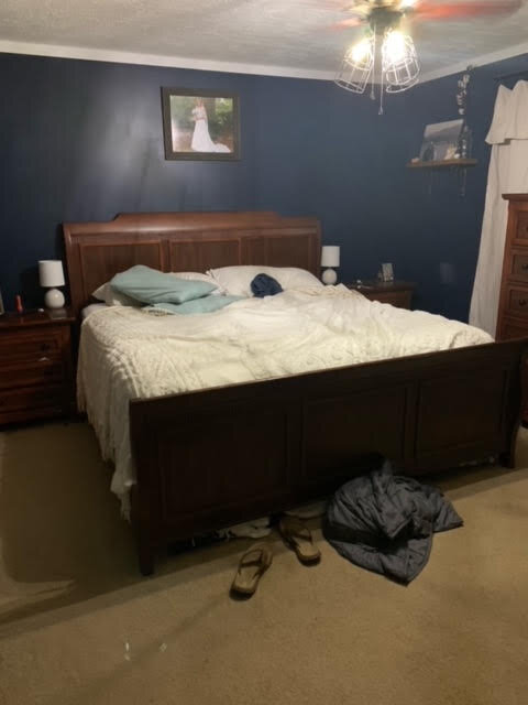
This project is especially close to my heart, because we know the Addingtons from our new church! They have two little boys and are the sweetest family, so it was an honor to help them update their bedroom! Before we get to the afters, lets take a look at the before pictures that were sent over!
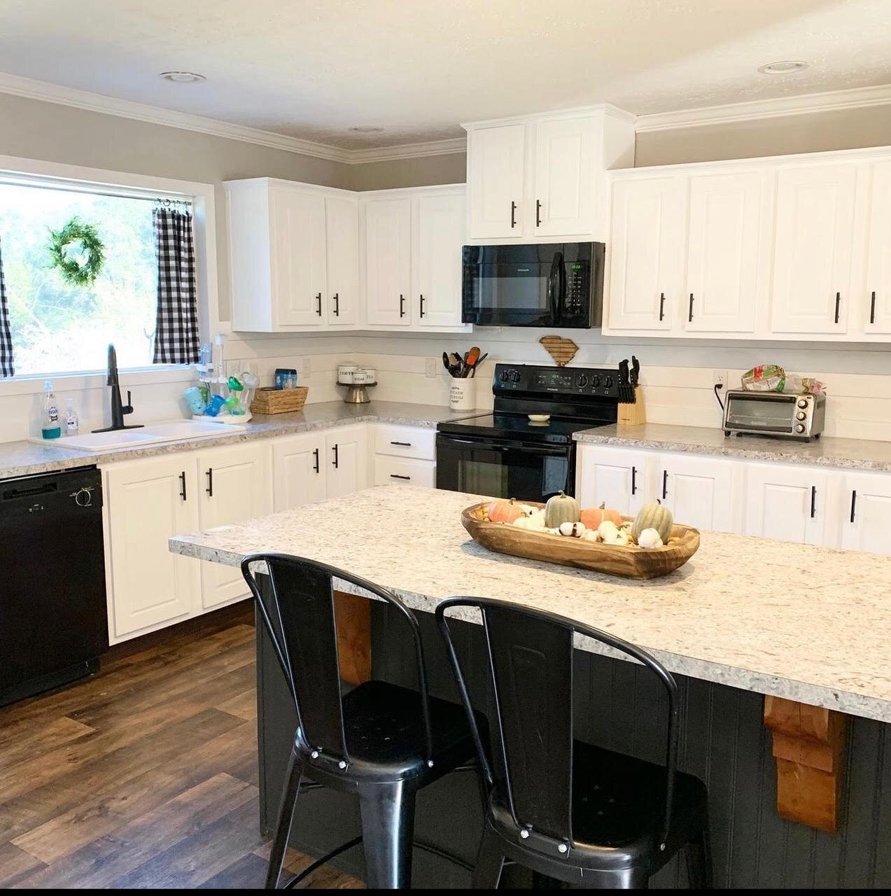
Now for the little details on their project! They were gifted their furniture so it needed to stay for the time being, they also were wanting to be budget conscious and had a doable, but small budget for the renovation. They wanted the space to be light, bright, and airy, have a little color, and needed a storage bench/ottoman at the end of the bed. I was also sent these photos of the rest of their home to get a sense of their style!
Isn’t their home beautiful?! To get started, I wanted to lighten the walls, but still have some color with an accent wall. I chose to paint the wall with the windows because no dark furniture is against it so it helps the space feel lighter! The paint colors used in this project were SW Pure White and SW Slate Tile. I also added in an upholstered bed to lighten up the space with white fluffy bedding. The addition of a rug grounds the design and a mirror helps light bounce around the space. I suggested changing the hardware on their current dresser and nightstand for a more updated look and either purchasing the new bed or painting their current bed for the same look. The top 4 items I suggested for the biggest impact was the paint, rug, bed, and storage bench. I love how the design adds the black accents that are found throughout their home already and uses pieces that are important to them! Here are the renderings that I sent them!
Since this was a budget makeover and all products are retail, I linked similar items to my like to know it page for anyone else interested in making a big design impact with a little amount of money. You can find some of the exact items and some similar items as well! This total project was under $1500 with the top 4 items I suggested being under $500! I love helping people realize they can still have a beautiful, functional space with any budget!
March: Modern Coastal Seating Area
Can you believe March is already almost over?! It's gone by so fast! This month's blog post is showcasing some of my favorite items that I've had my eye on from Lulu & Georgia!
First off, this natural pouf is perfect for adding texture to your home! You can shop this pouf by clicking the photo below or clicking here. I love adding poufs by accent chairs and they are so versatile as they can be used as an ottoman, side table, or additional seating if needed when entertaining.
This pillow is subtle and sophisticated and perfect to simply refresh your home for spring. At only $46 it's a great deal and a perfect addition for spring!
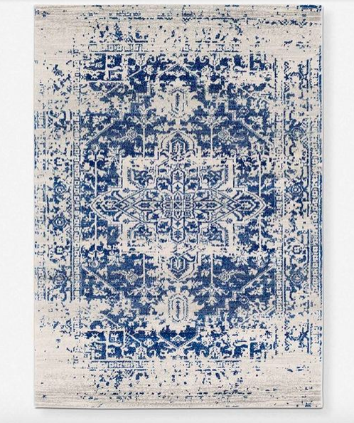
This rug is bold & rich and adds richness to any space! The distressed design of this beautiful area rug gives it the chic, lived-in look of a far-flung market find, while also being durable enough to place in high-traffic areas. In an alluring white and blue palette, this ornately patterned floor rug is a timeless and adaptable accent to curate your home with.
This Chair is leather so it's perfect for kids, pets, entertaining, all the things! Belted straps add support along the bottom and back of this unique chair. Finished with soft leather cushions, the Kenneth chair puts a contemporary spin on a classic mid-century aesthetic.
These elements all work together seamlessly to create a comfortable, modern coastal look! Add relaxing hues of green with a fiddle leaf fig, a small side table, and a jute basket pendant to complete the look! How adorable would this little set up be on a back porch for the spring/summer? I love all the texture the coastal looks adds into a space and its perfect for creating a warm & inviting ambiance! Let me know if you snag any of these items while they are on sale! :)
That's it for now! If you need even more help to make your house a home, set up a complimentary consultation with me today where we can discuss your specific needs even further!
Thanks for following along!
Best,
Emily Bullister
owner/lead designer
Before & After: Primary Bedroom
These sweet clients were moving into a new home that they were renovating. They reached out for help with their primary bedroom. I helped them visualize the potential in their new bedroom. We updated all the wood trim to white, enlarged the closet, added new doors, and fresh paint. That’s it! The rest is furniture and design. Take a look at these before photos!
I loved being a small part in helping this house become a home to make lots of memories for this family. Stephanie had a specific look she was going for and by working together we were able to nail down exactly what she was looking for! They were wanting to keep their storage bed, add a vanity area for Stephanie, and a dresser for storage. They were drawn to light wood tones, crisp white bedding, and relaxing neutral tones. They had a dog so a white duvet was out and their current headboard was a maple color so light wood tones wouldn’t look quite right. I added fresh white paint to the walls to give a light and bright feeling to the room added contrast with a dark gray comforter and used white and similar wood tones for the vanity and dresser. They met with the contractor the next day and are so excited to get started on their project!
Take a look at these after photos!
Before & After: Seattle Living Room
This customer was moving into a new home and was wanting to furnish and decorate her living room. She was looking for a family-friendly space since she has two young children but also needed additional storage if possible. The house had two cut out niches by the fireplace which she wasn’t sure how to use. They needed help with a layout that would provide ample seating space for entertaining, allow for a small table and chairs set, have storage, and be kid-friendly! She described her style as Bohemian with Asian Zen. They wanted to have pieces that represent different parts of the world as they enjoy traveling.
Take a look at some of the before photos:
Before Photo Showing the Cut Outs
Since I also have two small kids I knew what was needed to make the space kid friendly. Right away, I knew the design would need to have performance materials and/or leather. Also, that the tables needed to be round so there were no sharp edges for the kids to run into. From there I started working on a layout that would open up the room, but also offer lots of seating and open floor space for playing. After taking a look at their inspiration photos, I realized warm wood tones with pops of rich, deep colors would bring a cozy and comfortable atmosphere to the space. To start out, I focused the majority of the budget on the large pieces that were going to be getting the most wear from kids. This included leather accent chairs and a large sofa chaise for entertaining that features washable cushions in a dark fabric to hide spills. I added in a Moroccan rug with warm wood tones to create the comfortable, cozy ambiance that they were wanting. I used the large cut out by the fireplace as a nook for a large media console that offered plenty of hidden storage for toys and art supplies, and the TV easily hid the smaller cut outs. A bench by the fireplace was added for even more seating space and I used one of their current bookcases for additional storage space.
Now for the Renderings that were delivered:
The bench by the fireplace is perfect for additional seating when entertaining!
Including a media console that features lots of hidden storage so it can be used for toys, crafts, games, etc.
The leather accent chairs are beautiful & leather is easy to clean, perfect for kids or pets!
Design Process: Primary Bedroom
These clients were building a new home and were looking for a calming retreat for their primary bedroom. They have a dog and a young child so they were looking for something comfortable, stylish, yet also durable. They were open to all new furniture, but did have a gray upholstered bed they were open to using in the room if needed but it could also go in the guest bedroom.
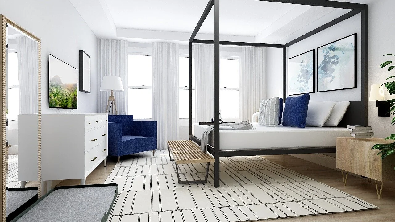
I envisioned a space that added light wood tones for warmth, added textures, and a neutral color scheme with pops of blues and greens to add a calming element to the room. The client mentioned that the dog sleeps in their room, but doesn’t get on the furniture which made it possible to add light-colored bedding to the design. They had a small, but totally doable budget so I focused on items that would make a large impact with a small amount of money.
After sending over a space plan I got to work sourcing items that would create a calming retreat for my clients. I added a dog bed, reading nook, bold canopy bed, and slatted wood bench. I love the way the wood tones work seamlessly with the canopy bed. The slatted bench adds a fun, unexpected touch to the design and the geometric rug pulls the design together. The artwork and accessories finish the space. I added a pop of color with the reading chair which is also in a performance fabric so it’s perfect for their everyday life with a dog and toddler. I ended up sending over one design with a new canopy bed and one design with their current gray upholstered bed so they could easily visualize each option and make the best decision for them!
Design Process: Art Deco Library
When I first spoke with our client she had a vision for the space which isn’t unusual when speaking with clients, most people know what they want, just not how to get there which is where I come in to help. They were looking for a dark and moody library where they could entertain small gatherings, curl up with a good book, and have a drink and relax. She had wallpaper they had fallen in love with and two bookcases she had bought. She knew what they wanted and how they wanted it to look, just wasn't sure what pieces to put together to pull it off. A couple of the challenges they were experiencing were needing storage space, entertaining space and camouflaging certain parts of the room like an electrical box and air return. The space only had one small window so another challenge was to give a moody feel but without making it too dark and depressing. Here is one of the before photos.
Process: I sent out my client intake form to get to know our client's needs and challenges with the space. I also learned about their budget and saw a couple of inspiration photos that they had pulled. After reviewing their answers and taking a look at their before photos we had a phone call to discuss and go over their project. From the first phone call we hit it off and as I was throwing out a couple of ideas I had for their space they were totally on board and we seemed to be on the same page. After our call, I started working on a couple floor plans for their space. I sent them a couple of options and they gave their feedback and we ended up collaborating on a new layout that flowed nicely and met their needs. Design is a process and working together is a normal part of the design process! Once a layout was decided on I started designing! From the beginning, my thought process was adding in brass metal, bold jewel toned colors to create a moody feel, and ample storage space. I had originally thought about adding in emerald, navy, and black and gold. During our phone consult our client liked that idea but had also mentioned thinking of an eggplant or deep purple color. I kept that in mind, and when I found the mulberry sofa I knew it was meant to be!
End Result: I love how the end result came out! The boldness of the mulberry sofa with the wallpaper is striking and beautiful. Its a bold focal point as soon as you walk into the space and gives off the art deco vibe instantly. Adding in the two bookcases they had currently purchased with a credenza gives ample of storage space. A large mirror helps light bounce around the room to keep it from feeling too dark and brass finishes add lightness into the space. All of these aspects work together to create a moody design that isn't depressing. The best part was that our client's loved the space as well! Our clients received these 3D renders of their space, a shopping list with all the items found in the space, and the floor plans. They are now able to slowly work on the room buying piece by piece, or easily completing it all at once!
You can view more of the final renders Here!
Why Interior Design?
It all begins with an idea.
Why should you chose to spend your hard earned money on interior design? The simple answer is because interior designers are experts in creating more spaces, improving the efficiency of the space, the functionality of the space, improving the lighting effect, color effect, and improving the textures, pattern, and layout.
E-design is a specialty of interior design where you able to work remotely with an interior designer. Since everything is done remotely you are able to save money and time!
When you chose Creating Homebase for your e-design needs you are supporting a small business, and a portion of your purchase gets donated to charity! Your first step will be to fill out a questionnaire where you explain your style and link your Pinterest account. If you don’t have a Pinterest home board, I highly recommend you starting one as I find Pinterest one of the best resources for understanding your style. From here you will send over a simple drawing and measurements of your space as well as pictures! From there I will get busy building your 3D model and creating a mood board for you! Once you approve the mood board, I will get started on your designs!
Why should you choose Creating Homebase over a large company? I have no affiliations with any furniture companies so I am able to choose the best items for your space no matter the design. Did you know the large e-design companies only have a handful of vendors they do business with? I am able to source pieces from anywhere you like to shop so the whole process works better for you!


